

CASE STUDY #4: CUPCKE
Category: Triathlon, Cycling, E-commerceDeliverables: Apparel Graphics, Social Posts, 3D Renderings, Custom Illustrations, Bespoke Seamless Patterns, Marketing Materials
My Role: Senior Designer & Illustrator
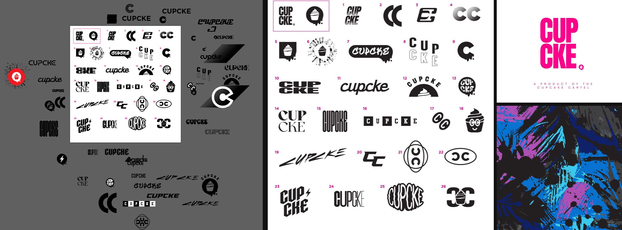
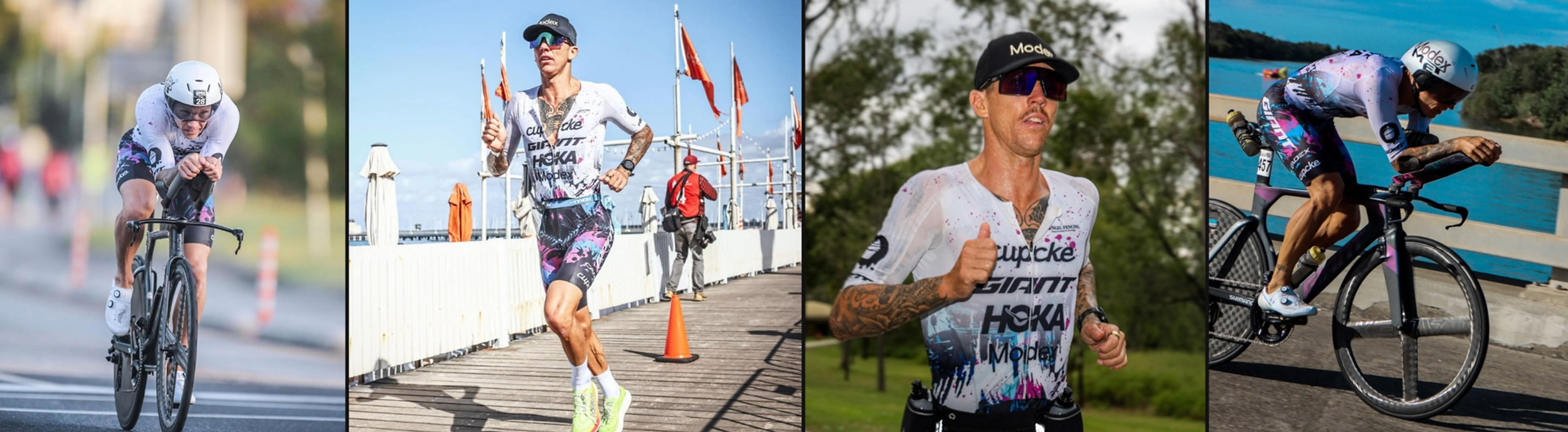
Objective: Support Cupcake Cartel’s transition to an independent, Australian e-commerce triathlon brand by updating their outdated CUPCKE wordmark and applying the refreshed branding to a custom suit designed to help secure their first sponsored athlete, professional triathlete Tim Van Berkel, from 2XU.
Timeline: 2-days for initial concept of logos and suit.

Design Process
The most critical task was creating an iconic, instantly recognizable wordmark, as the brand’s identity and ability to attract pro athletes depended on it. I explored retro iconography, script fonts with a modern-meets-vintage feel, and bold sans serifs with clean line work—kept strictly in black and white for maximum impact.
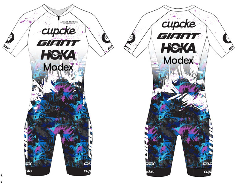
For the kit, following Tim’s request for a palette of black, blue, purple, pink, and white inspired by his coastal Australian roots, I illustrated a seamless graffiti-style palm leaf pattern. To finish, I layered a subtle neon pink paint splatter to energize the stark white and unify the design.
FINAL DESIGNS
IMPACT
The graffiti kit became Paragon’s top-selling product and the only custom jersey and bib they stocked year-round, paving the way for Pearl Izumi to secure additional in-line business alongside custom orders. Impressed with my ability to translate his bold ideas into fully realized designs, their buyer requested me as the exclusive designer for five consecutive years of custom releases. During this partnership, I generated six-figure profits in custom orders for Pearl Izumi.
THERE'S MORE
ALL DESIGNS ARE BUILT from scratch
From seamless patterns and custom typography to brand assets and illustrations.
I was the sole creative behind each of these designs.


